Clearfix is a technique that is used to make every floated child element get placed inside the parent. It makes the parent element stretch to fix the floated child elements inside it. The parent element collapsed without the clearfix.
When you find the layout with floated elements, you might find the parent container doesn’t expand to make the child element fit in. This caused a break in the layout and some visual issues. Let us discuss the clearfix and its importance with different examples in this blog.
Table of Contents:
Why Do We Need Clearfix?
When the child element inside the parent container becomes floated, the parent container forgets about the child’s height. This leads to the following issues:
- You can see the parent container collapses to zero height.
- The non-floated elements may overlap the parent container.
- The alignment of the page gets breakouts.
Example without clearfix:
<!DOCTYPE html>
<html lang="en">
<head>
    <meta charset="UTF-8">
    <meta name="viewport" content="width=device-width, initial-scale=1.0">
    <title>Without Clearfix</title>
    <style>
        .container {
            background-color: lightgray;
            border: 2px solid black;
            padding: 10px;
        }
        .box {
            width: 100px;
            height: 100px;
            background-color: blue;
            float: left;
            margin: 5px;
        }
    </style>
</head>
<body>
    <div class="container">
        <div class="box"></div>
        <div class="box"></div>
    </div>
</body>
</html>
Output:
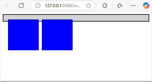
Issue: You can see the container does not wrap up the floated .box elements, which causes the container to collapse.
Method to Fix This Using Clearfix
You can use methods such as the overflow property, adding an empty clearfix element, or using the clearfix pseudo-element to fix the floated elements. Let’s discuss these methods below.
Method 1: Using the Overflow Property
You can use the overflow: hidden property on the parent element to make the child element fit in the parent container. This method enforces this mechanism on the floated child elements. If you use the float: left property it is removed from the normal flow, which makes the parent container ignore their height.
Example:
<!DOCTYPE html>
<html lang="en">
<head>
    <meta charset="UTF-8">
    <meta name="viewport" content="width=device-width, initial-scale=1.0">
    <title>Clearfix with Overflow</title>
    <style>
        .container {
            background-color: lightgray;
            border: 2px solid black;
            padding: 10px;
            overflow: hidden;
        }
        .box {
            width: 100px;
            height: 100px;
            background-color: blue;
            float: left;
            margin: 5px;
        }
    </style>
</head>
<body>
    <div class="container">
        <div class="box"></div>
        <div class="box"></div>
    </div>
</body>
</html>
Output:
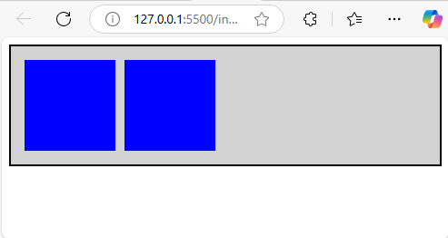
Explanation: You can use the overflow: hidden property to create a grey container with two blue boxes floating to the left. This method avoids the collapse of the parent container with the floating child elements.
Method 2: Using the Clearfix Pseudo-Element
You can use the ::after pseudo-element to make the float elements inside the parent element. It is the most recommended way to clear floats.
Example:
<!DOCTYPE html>
<html lang="en">
<head>
    <meta charset="UTF-8">
    <meta name="viewport" content="width=device-width, initial-scale=1.0">
    <title>Clearfix with ::after</title>
    <style>
        .container::after {
            content: "";
            display: table;
            clear: both;
        }
        .container {
            background-color: lightgray;
            border: 2px solid black;
            padding: 10px;
        }
        .box {
            width: 100px;
            height: 100px;
            background-color: blue;
            float: left;
            margin: 5px;
        }
    </style>
</head>
<body>
    <div class="container">
        <div class="box"></div>
        <div class="box"></div>
    </div>
</body>
</html>
Output:

Explanation: You can use ::after to add a pseudo-element for making the float elements get inside the parent container. The blue floated elements fit into the floated left of the parent container.
Method 3: Adding an Empty Clearfix Element
You can use an empty <div> with clear: both to the end of the floated elements to make it fit in the parent container.
Example:
<!DOCTYPE html>
<html lang="en">
<head>
    <meta charset="UTF-8">
    <meta name="viewport" content="width=device-width, initial-scale=1.0">
    <title>Clearfix with Empty Div</title>
    <style>
        .clear {
            clear: both;
        }
        .container {
            background-color: lightgray;
            border: 2px solid black;
            padding: 10px;
        }
        .box {
            width: 100px;
            height: 100px;
            background-color: blue;
            float: left;
            margin: 5px;
        }
    </style>
</head>
<body>
    <div class="container">
        <div class="box"></div>
        <div class="box"></div>
        <div class="clear"></div>
    </div>
</body>
</html>
Output:

Explanation: In this code, the class .clear is used to fit the child elements inside the parent div. The clear: both style ensures the parent container wraps around the floated blue boxes
Conclusion
The above-discussed methods are used to make the parent element stretch to fix the floated child elements inside it using clearfix. You can use the overflow property, add an empty clearfix element, or use the clearfix pseudo-element to fix the floated elements. This makes your layout stable and visually appealing.
What is a Clearfix? – FAQs
1. What is a clearfix?
A clearfix is a CSS technique that is used to fit the floating child elements within the parent elements
2. Why do you need a clearfix?
When child elements are floated, the parent container often collapses because it doesn’t recognize the height of the floated elements. Clearfix fixes this problem.
3. How does clearfix work?
It adds a clearing mechanism with ::after or overflow to ensure the parent container expands to fit its floated children
4. What are the common ways to implement clearfix?
You can use overflow: hidden on the parent, add a ::after pseudo-element, or insert an empty clearing <div> inside the container.
5. Which clearfix method is better?
It depends on your use case. overflow: hidden is simple but might cut off overflowed content, while ::after is flexible and widely used.