The best pie in the world is the homemade buttermilk apple pie my grandmother baked every Thanksgiving (let me have this one, ok?). I’ll never be able to re-create it, but as the saddest consolation ever, I’m really good at making pie charts.
Here, I’ll guide you through how to make a pie chart in Google Sheets—from entering your data correctly to customizing every slice to fresh-baked perfection.
It’s no family recipe, but it can turn out almost as pretty.
Table of contents:
How to make a pie chart in Google Sheets
First, I’ll walk you through how to create a simple pie chart. Just the data, no bells and whistles. If you want more details, keep reading.
-
Input your data into a new sheet.
-
Highlight the data range you want included in your pie chart.
-
Click Insert, and select Chart.
-
If it doesn’t automatically create the chart as a pie chart, in the Chart editor panel that appears, select Pie chart under Chart type in the Setup tab.
-
Customize your chart however you want by clicking the Customize tab in the Chart editor. You can change the labels, colors, and all sorts of other things.
-
To export, click the three dots in the top-right corner of the chart, select Download, and choose your file format.
If that didn’t do the trick, here are a few more specifics.
1. Input data into a new sheet
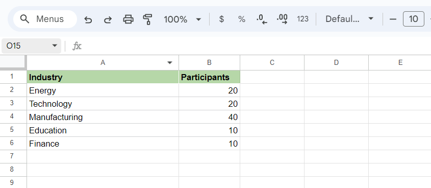
The first step is to input your data into Sheets correctly. Data should be in two columns, one for the categories and one for the corresponding values. In this example, our category is Industry, and the value is the number of Participants from each industry. (Sheets will automatically turn those into percentages when you make the pie chart.)
2. Select the data range
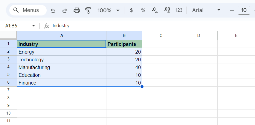
Next, select the data range. Click and drag to highlight the range of data you want to include in your chart. Make sure to include all fields—including column headings—you want to include in the chart, not just the numbers.
3. Insert chart
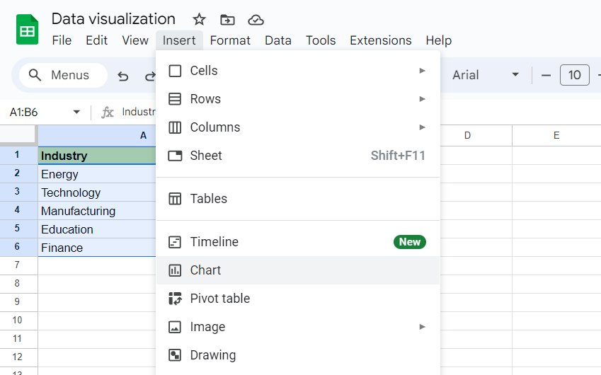
Time to wave the pie chart wand. Go to the top menu, and click Insert > Chart.
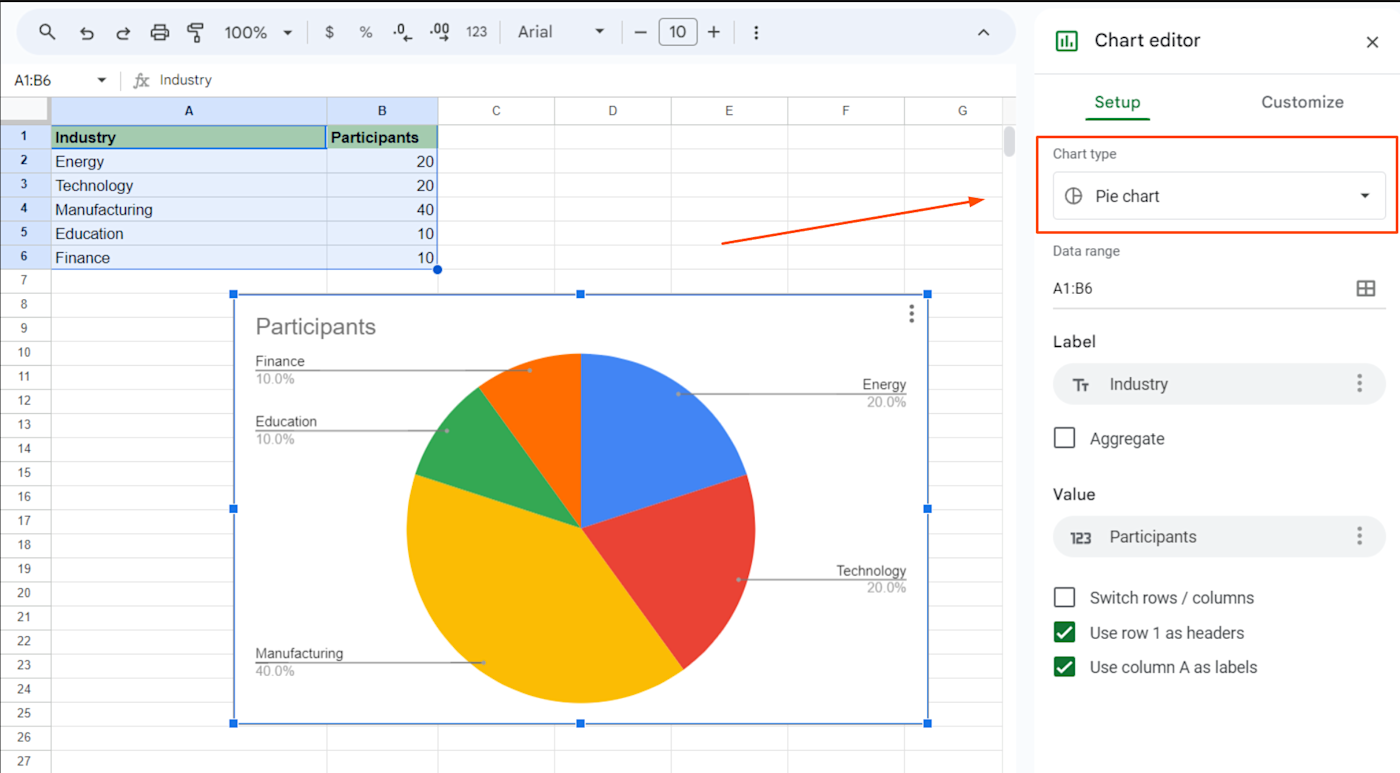
You’ll immediately see a chart pop up on top of your sheet. Depending on the data you have, Sheets might guess that you want a pie chart and give it to you right away. If it doesn’t, in the Chart editor that appears on the right side, look for the Chart type dropdown, and select Pie chart.
4. Customize the title
Right now, your chart title may be a little vague (“Participants”). To change that, click on the chart, and then go to the Customize tab in the Chart editor.
Click Chart & axis titles to expand it. Under Title text, replace the existing title with whatever you want it to say.
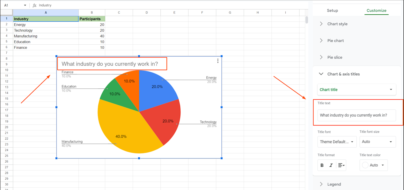
Once your title is in place, your basic pie chart is ready to go.
Note: If you change the data used in the chart, your pie chart will update to reflect the new data automatically.
Customize your Google Sheets pie charts
Now that you can make a basic pie chart in Google Sheets, you may be ready to shake things up. Dazzle stakeholders with colors, sparkles, and digital glitter glue.
Here are some additional customization options:
-
Chart style: To change the background color, font, and border color, go to the Chart editor. Under the Customize tab, expand Chart style and adjust the color and font options to your preferences.
-
Adjust chart size and layout: Click on the chart, grab the corners or edges, and drag to expand it for better readability.
-
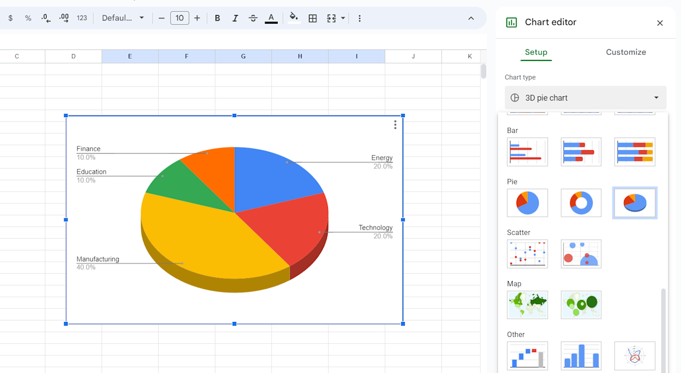
Convert 2D charts to 3D: In the Chart editor, under the Setup tab, select 3D pie chart to switch from 2D to 3D.
-
Customize slice labels: In the Chart editor, under the Setup tab, expand the Label dropdown to choose which field to display next to each slice.
-
Customize label font and style: In the Chart editor, under the Customize tab, expand Pie chart and adjust the Label font and Label font size options to your preferences.
-
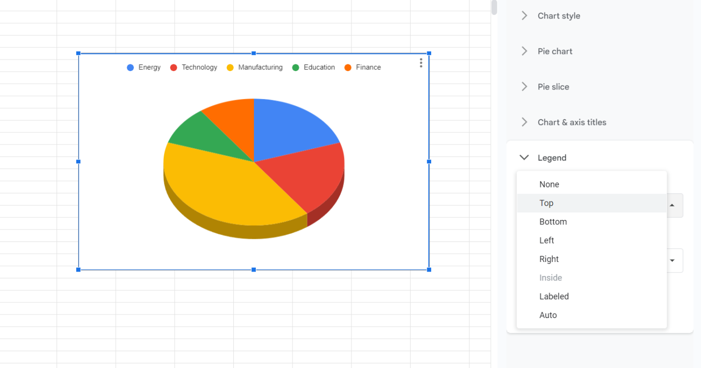
Change legend position: In the Chart editor, under the Customize tab, expand Legend, and select the desired position from the Position dropdown menu. You can choose from Top, Bottom, Left, Right, None, Auto, and Labeled.
-
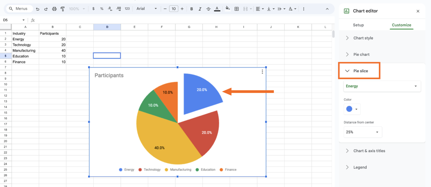
Change slice appearances. In the Chart editor, under Customize, expand the Pie slice section and choose the slice you want to adjust. You can then change the color of the slice and even separate it from the chart.
How to export and share a Google Sheets pie chart
Unless you plan to beam it into your coworkers’ minds, mental telepathy style (valid), it’s time to export your Google Sheets pie chart.
Click the three dots in the top-right corner of your pie chart.
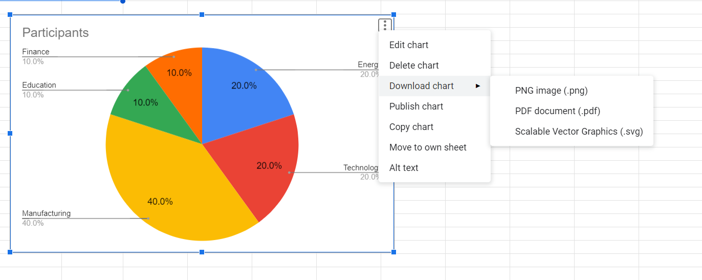
You’ll have the following options:
-
Download: Click Download chart and select if you want to export your chart as a PDF, PNG, or SVG.
-
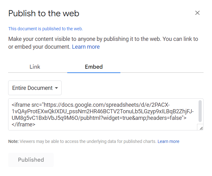
Publish: Click Publish chart, and you can either link directly to the chart, or embed the chart’s code on the web.
-
Copy: Click Copy chart, and the image will be saved to your clipboard. Then, you can paste it elsewhere in that sheet or into a different sheet or document.
How to make a pie chart from data in multiple sheets
So now we know how to make a pie with only one set of ingredients. But what if you have data in multiple sheets? Think of it like doubling the recipe. It’s possible, but you’ll have to do a little extra work.
-
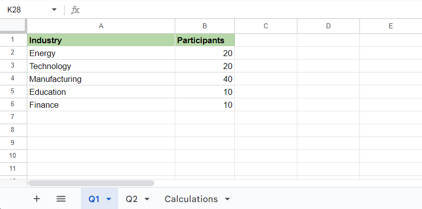
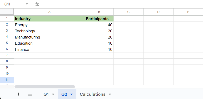
Ensure all the sheets you want to use in your pie chart have standardized column headers. The datasets you want to combine need identical labeling.
-
Add a third sheet to your doc to consolidate data. In this example, we have a sheet called Q1 and a sheet called Q2, which we’ll combine in a third sheet called Calculations.

-
In your new blank sheet, go to the top menu and click Insert > Chart. Under the Chart type dropdown, select Pie chart.
-
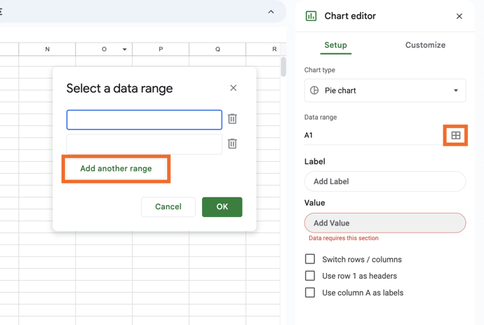
In the Chart editor, under the Setup tab, click the Select data range icon (the little grid of four boxes) in the Data range section, and click Add another range to create fields for each sheet you want to include (two fields for this example).
-
Input the formula
[Sheet name]![Cells:Cells]for each set of cells you’d like to add, customizing the sheet name and cell range accordingly.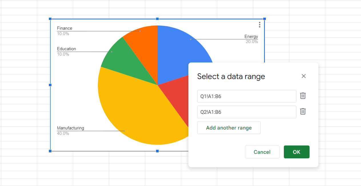
In this example, those codes would be
Q1!A1:B6andQ2!A1:B6since the data we want to include from sheets Q1 and Q2 are found in columns A through B and rows 1 through 6. (Be sure to put a single quotation mark around any multi-word sheet names and leave no spaces between any of the other symbols.)
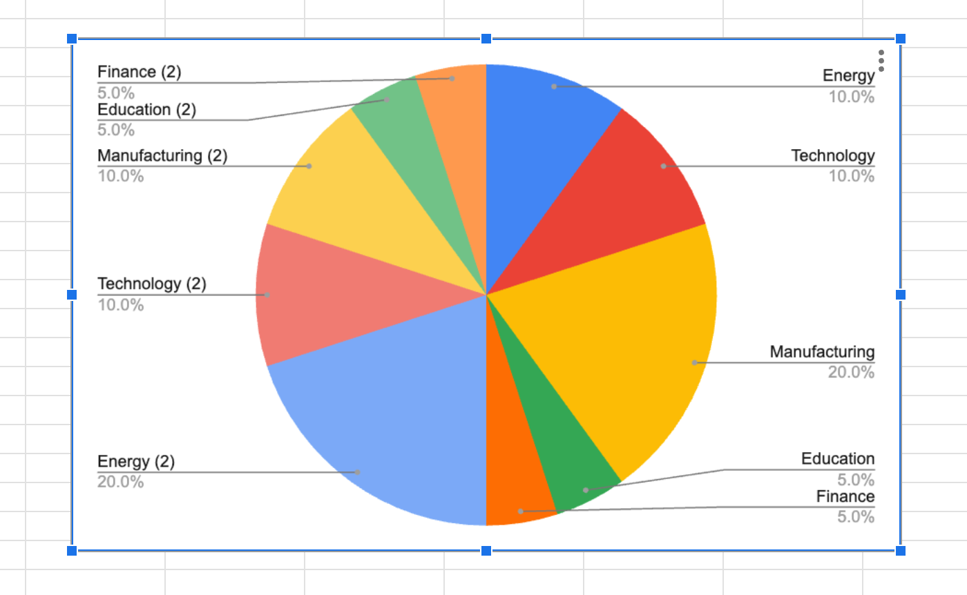
Now, data from every sheet you selected will be combined into one pie chart with slices for each line you included (in this case, five from each sheet).
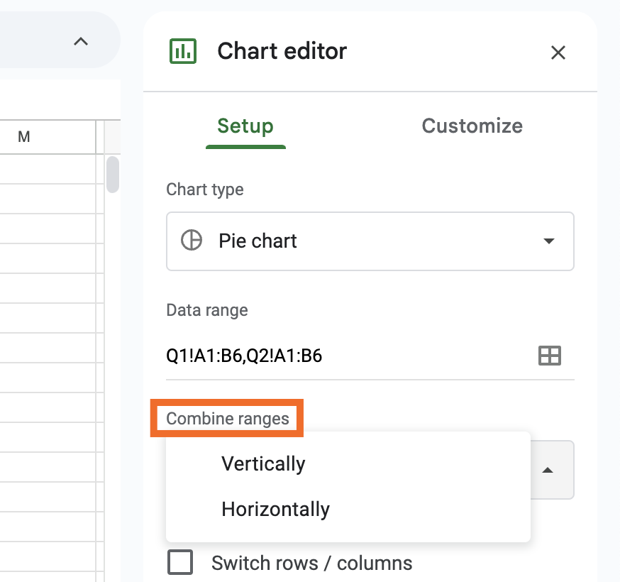
If the full dataset isn’t populating, you may need to tweak the settings by going to Setup > Combine ranges and toggling between Vertically and Horizontally. In my case, it was set to horizontal by default, and switching to vertical ensured the data was aggregated from vertical cells in my input data.
Automate Google Sheets
Pie charts help viewers easily digest insights by instantly visualizing trends, patterns, and proportions. It’s all the same data you’re already working with—just now with a fresh-baked crust.
To get that data into (and out of) Google Sheets easier, integrate it with Zapier. Then you can connect Google Sheets to thousands of other apps to automate your workflows. Zapier can automatically add new rows to your spreadsheets based on activity in other apps, notify teammates when your reports are updated, or send data to other apps when you update a specific sheet.
Learn more about how to automate Google Sheets, or check out these pre-built automations.
Zapier is a no-code automation tool that lets you connect your apps into automated workflows, so that every person and every business can move forward at growth speed. Learn more about how it works.
Related reading: