If you need a cool party trick, why not level up your spreadsheet game? After all, no one is ever more popular than the person who can create a pivot table in Excel on the fly. (…Right?)
Spreadsheets are great for storing huge amounts of information, but unless your brain is a computer, you’re going to need a little help organizing and drawing conclusions from that data. Pivot tables might sound scary to the uninitiated, but they’re actually pretty easy to create—and they can help give you more insight into what your raw numbers actually mean.
Here, I’ll walk you through how to create a pivot table in Excel. You can use my demo sheet to practice. Open the sheet in Excel online, and click Edit a copy to start working on your own copy. The examples in this tutorial come from that demo sheet, and you can use it to experiment further once you’re ready.
Note: For this article, I used the web version of Microsoft Excel, but the steps are similar in the desktop app.
What is a pivot table?
A pivot table filters and summarizes data in a spreadsheet based on criteria of your choosing. That way, you can slice and dice the data to get different insights from it—without recreating the wheel.
Let’s say you diligently log all your expenses across the whole year in a single spreadsheet. At the end of the year, when you sit down to review, you’re going to have a tough time sorting through hundreds of entries. This is what is called flat data—all you’re seeing is a sea of rows and columns. To gain more insight and meaning from the data, you need to see it dynamically. For example, you might want to see how much money you spent on rent and utilities in the last quarter. Using a pivot table, you can do just that.
What are pivot tables used for?
Seeing your household budget dynamically is just a simple example. A pivot table can be used to analyze an unlimited variety of data. You can do things like:
-
Seeing how many inventory items you sold by category
-
Understanding service income as a percentage of total sales
-
Auto-filling empty cells with a placeholder (like “$0” or “TBD”)
-
Combining duplicate row entries in an employee database
That means that you won’t have to create a new spreadsheet for each analysis—you can use the same data and manipulate it in the pivot table to get new insights each time.
How to create a pivot table in Excel
Here’s a quick overview of how to use pivot tables (we’ll dive deeper in the next section).
-
Open the Excel sheet, and select all cells containing the data you want to look at.
-
Select Insert > PivotTable.
-
From the pop-up, select New sheet (or choose from a pre-built template).
-
In the pivot table editor, drag the rows and columns that you want to summarize to the appropriate box.
-
In the Values section, select the fields that have the values you want to add or calculate.
-
If you only want to display values that meet certain criteria, use the Filters section.
The best way to learn complex tools is by using them. So load up the demo sheet, and follow along below.
Create the pivot table
The first thing we need to do is to turn the raw, flat data into a pivot table. Before starting, make sure that all the columns at the top of your sheet are properly named.
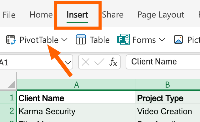
Then, select all cells that contain data, and from the toolbar, select Insert > PivotTable.
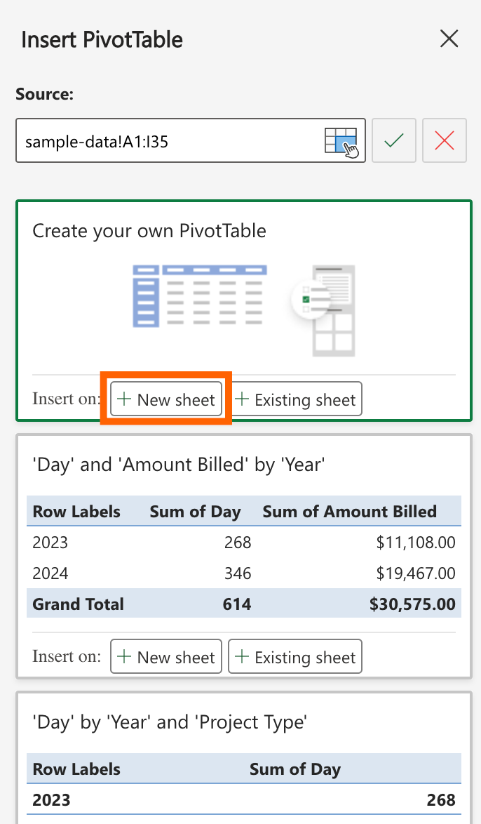
A pivot table creation sidebar will pop up. It will list the range of the table (the one that you’ve already determined by selecting the data) and give you the option of creating a pivot table in the same worksheet or a new one. You can also pick from a selection of pre-built templates. To make things simpler, choose +New sheet under Create your own PivotTable.
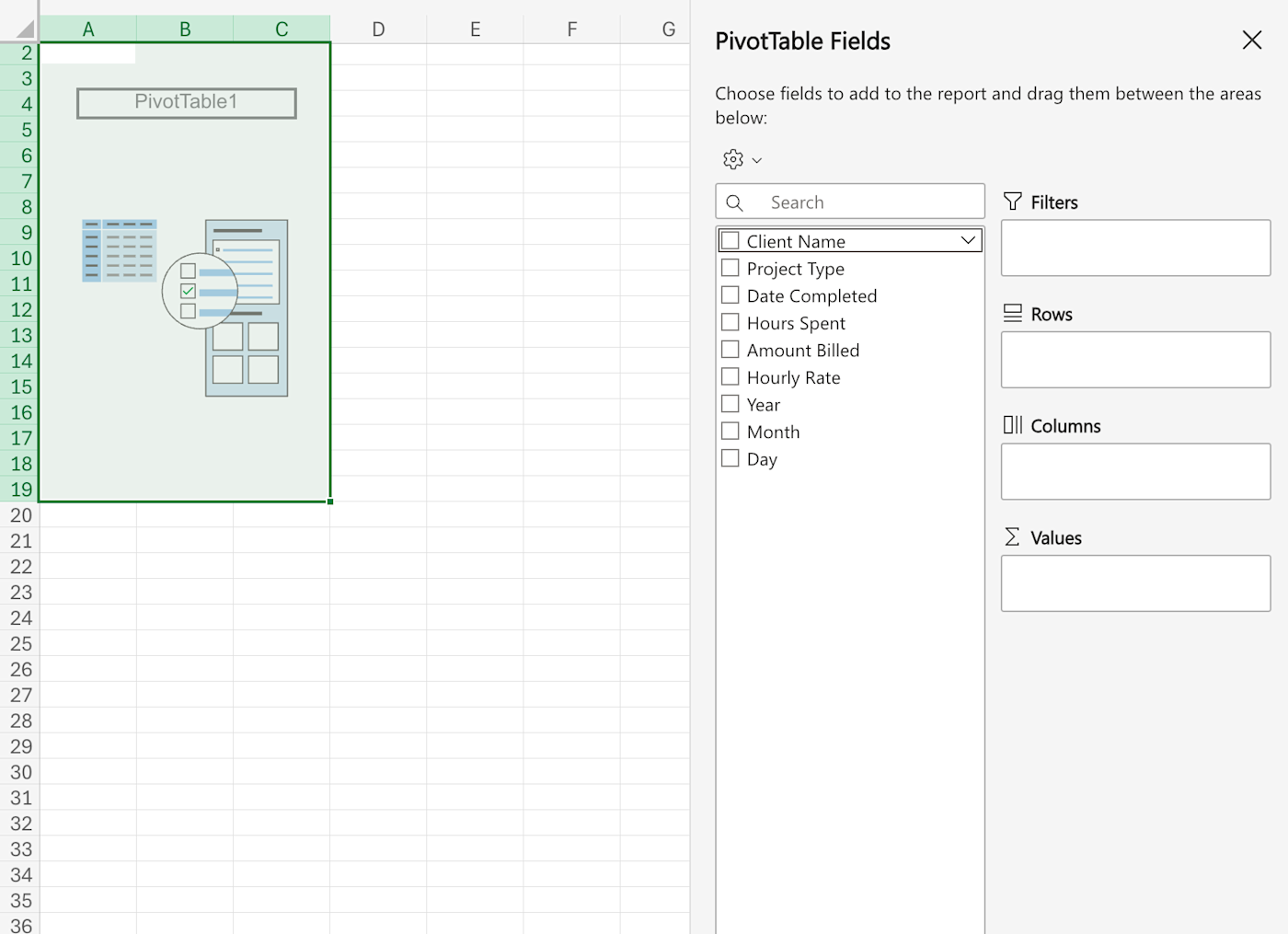
This will create a new spreadsheet where you’ll build your dynamic pivot table reports.
How to build a pivot table report
A pivot table starts out empty. All you’ll see on the right edge of the sheet is the pivot table editor, where you’ll find all the options for building your pivot table.
The editor is divided into two vertical sections.
-
The left section lists all the fields—these are all the columns from your table data.
-
In the right section, you’ll find the actual area for manipulating the pivot table. It’s divided into four parts: Filters, Rows, Columns, and Values.
The process of building a pivot table in Excel uses drag-and-drop functionality. You add a field to an area simply by dragging it there. Don’t want a field in a box anymore? Drag it out, and it disappears. Beyond that, you’ll learn how to use these tools as we go along.
To start, here’s the analysis we’re going to do as an example from the demo sheet:
For each of our clients, across different project types, how much did we bill in 2023?
In this case, we’re looking for four things.
-
For each client
-
across all project types
-
total amount billed
-
in 2023
This analysis is built from four parts, and it will cover all four sections in the pivot table fields: rows, columns, values, and filters.
-
The Rows and Columns will help you build the basic two-dimensional data from which you will calculate the third dimension of values. Here, our basic row and column data is Client Name and Project Type, respectively.
-
The Value, or the computation we want to get from the cells related to Client Name and Project Type, is total amount billed (the sum of the Amount Billed column).
-
The Filter option will help us filter only the data from the year 2023 and will hide everything else.
Now that we know what kind of report we’re building, let’s start the process by first adding the rows.
Add rows
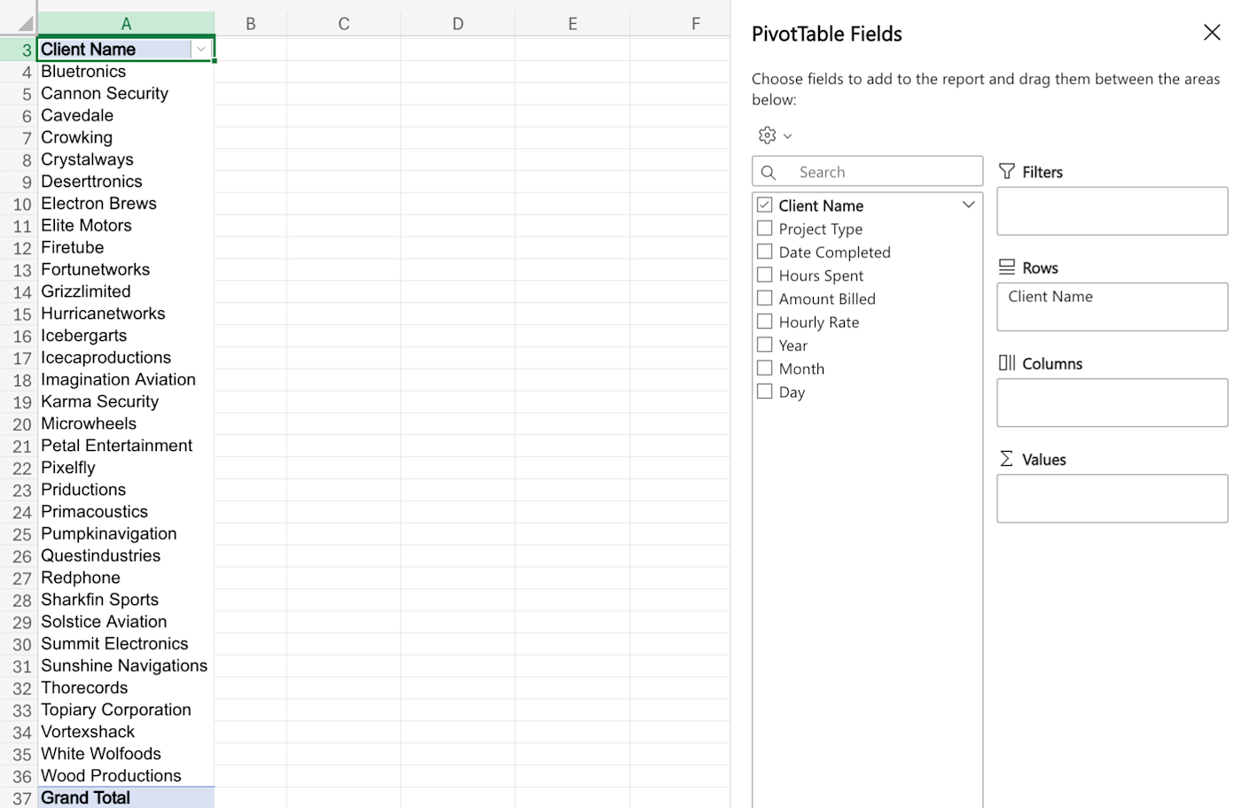
We’ll start by adding the Client Name field to the Rows section. There are a few ways of doing this (e.g., click the checkmark next to the Client Name title from the sidebar, click the dropdown at the end of the Client Name section and select Add to Row Labels), but the best way to proceed is by using the drag-and-drop feature.
Click and hold on the Client Name field, drag it to the Rows section in the right half of the sidebar, and release it.
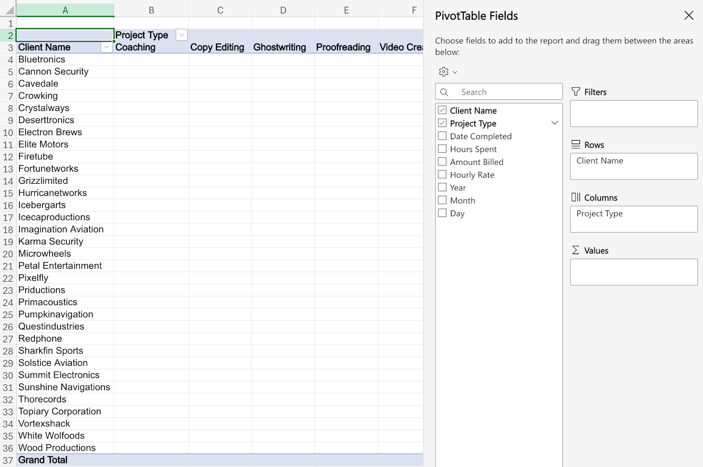
Instantly, you’ll see the first column populate with all the names of your clients (free of duplicates). By default, this will be sorted in ascending order, but you can click on the dropdown next to the Row Labels cell to change the order.
Add columns
Next, we’ll add the Project Type field as a column. Now that you know the drill, just drag the Project Type field to the Columns section in the pivot table editor.
Add values
Now you have a two-dimensional table, and it’s time to add values to that table.
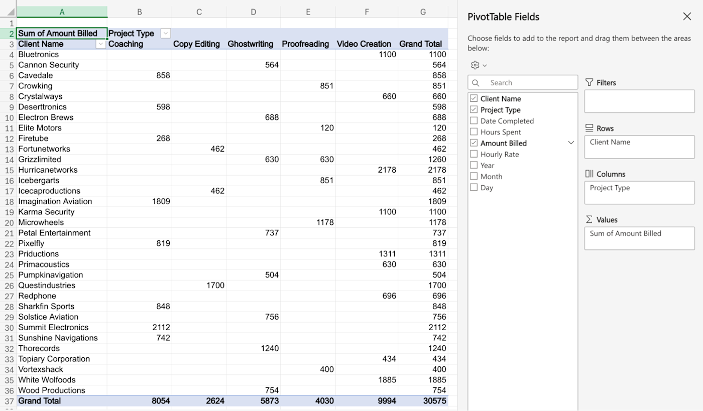
Drag the Amount Billed option to the Values section. Instantly, you’ll have usable information and data in the spreadsheet. You’ll notice that a Grand Total section is created automatically (both for rows and columns), and you can already see the grand total for a particular project type and a client independently.
Add filters
We still don’t have our complete answer yet. We now need to filter the data to only show values from 2023.
To do this, drag the Year field to the Filters section. You’ll see two new cells at the top of the sheet. The cell next to Year currently says All. Click on the dropdown next to the cell, uncheck the button next to 2024, and click Apply.
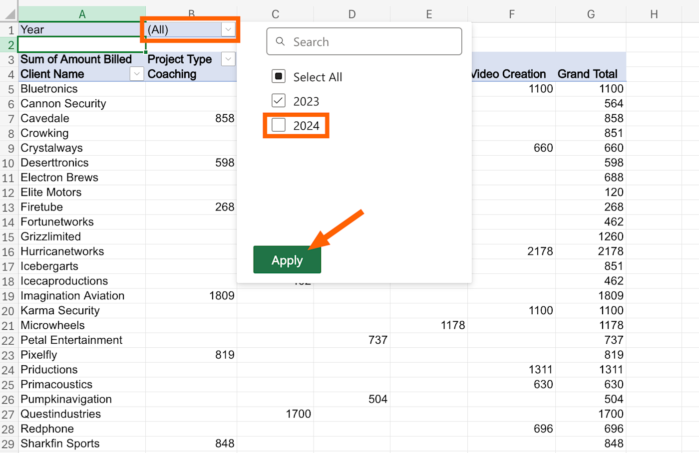
All the entries from the year 2024 will instantly disappear, and you’ll have your answer to the original question: For each of our clients, across different project types, how much did we bill in 2023?
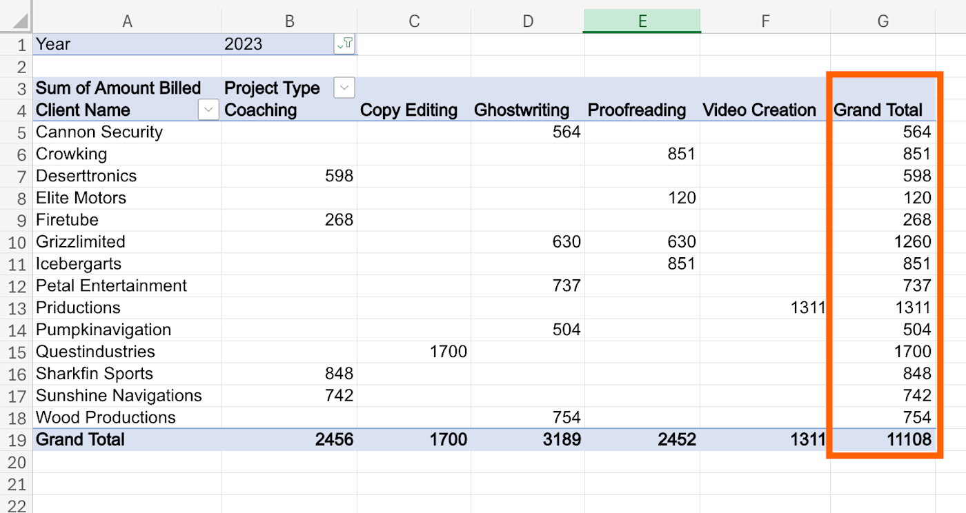
Of course, filtering isn’t limited to just the year. You can filter based on any column from the original data set.
How to refresh a pivot table in Excel
As you add, change, or delete data in your spreadsheet, you’ll want to refresh your pivot table to reflect those changes. The fastest way to do this is to right-click any cell in the table and click Refresh.
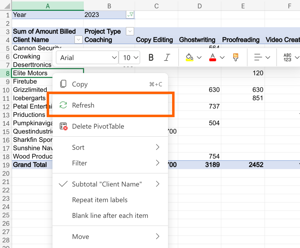
You can also refresh your Excel pivot table by clicking into the pivot table to show the PivotTable tab. Click the down arrow next to Refresh All.
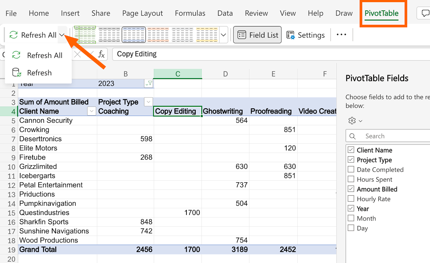
Click Refresh All to refresh every pivot table in your workbook at the same time. If you just want to refresh the pivot table you’re looking at, click Refresh.
Pivot tables don’t refresh automatically by default, but you can update the settings so that yours will update every time you open it. Just click into the pivot table so that the PivotTable tab appears, click that tab, and then click Settings.
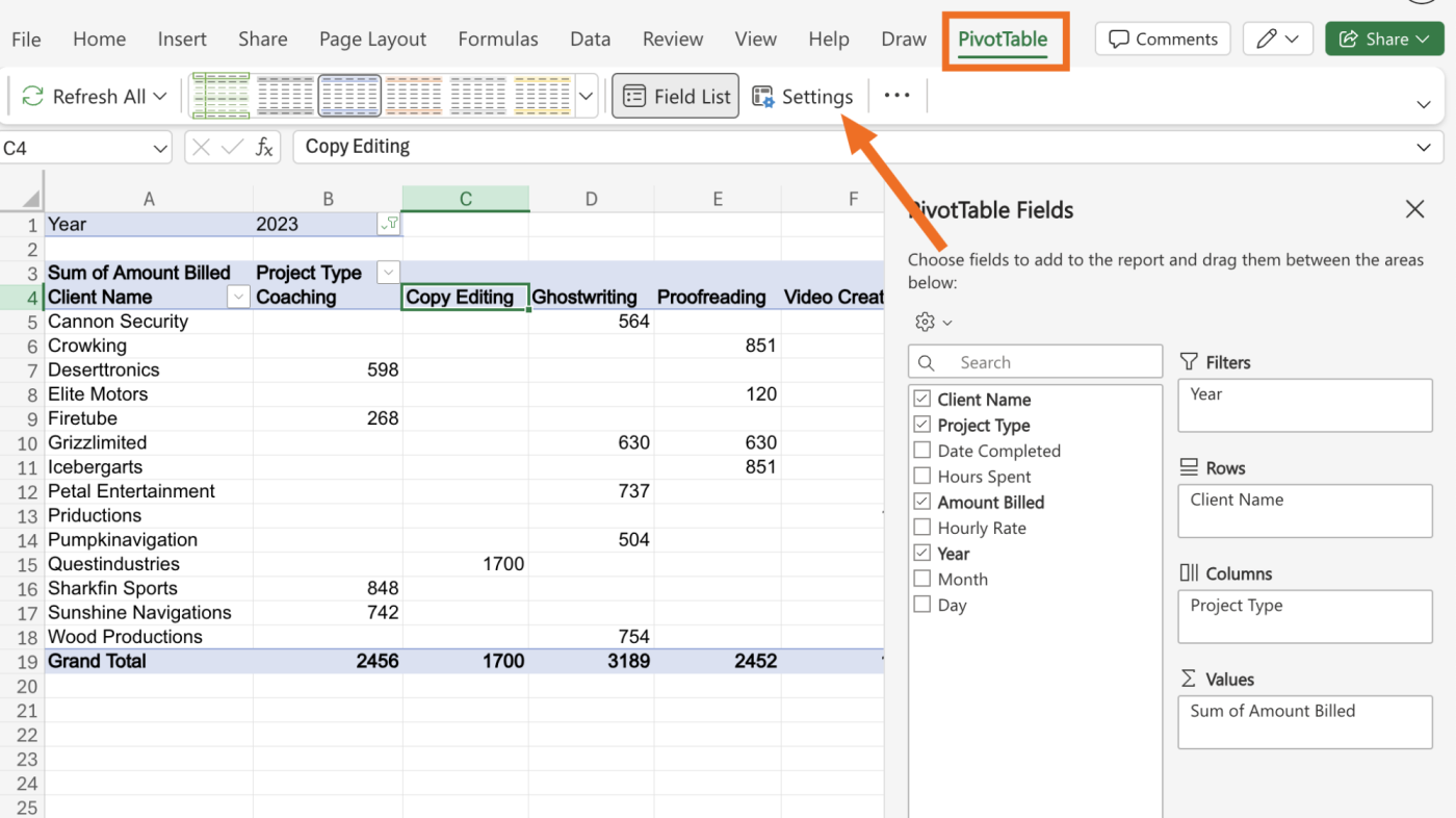
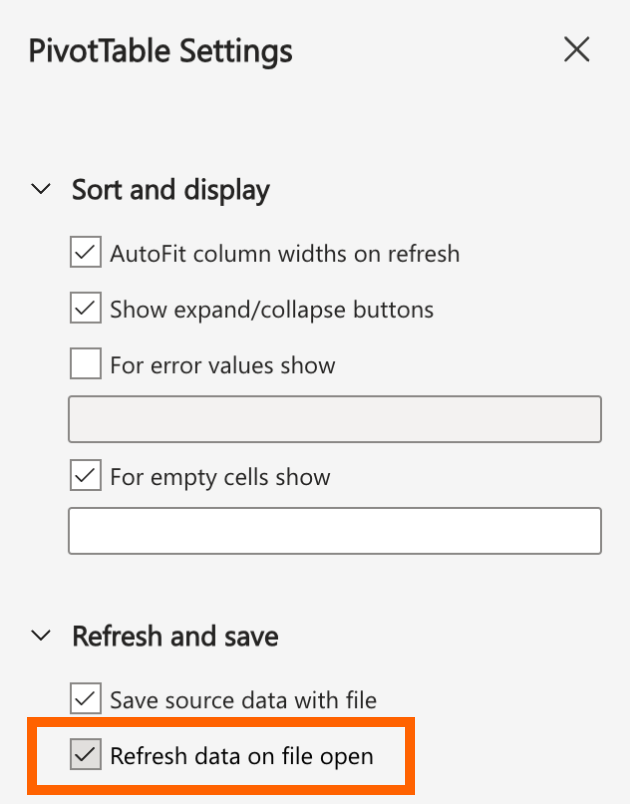
The PivotTable Settings pane should appear on the right side of the screen. Scroll down and click the checkbox next to Refresh data on file open.
Automate Microsoft Excel
Of course, for your pivot tables to be refreshing based on accurate data, you should try to avoid manual data entry as much as possible. Zapier lets you connect Excel with your most-used apps so you can automate spreadsheet-related tasks. For example, you can automatically add new sales data or form submissions to an existing workbook. Learn more about how to automate Excel, or get started with one of these workflows.
Zapier is the leader in workflow automation—integrating with thousands of apps from partners like Google, Salesforce, and Microsoft. Use interfaces, data tables, and logic to build secure, automated systems for your business-critical workflows across your organization’s technology stack. Learn more.
Diving deeper with Excel pivot tables
Now that we have all the important information in front of us, we can use the pivot table to answer any kind of question we have about the data. Let’s dive a bit deeper to solidify our understanding of pivot tables in Excel using two more examples.
Which client did we bill the most in 2023?
As this is a simpler question, we’ll need to first simplify our report. We only need the name of our clients as rows and the sum of the amount billed as values.
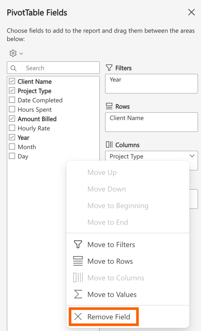
So start by removing the Project Type field from the Columns section: drag it out of the section (alternatively, you can click on the arrow next to the field and select Remove Field).
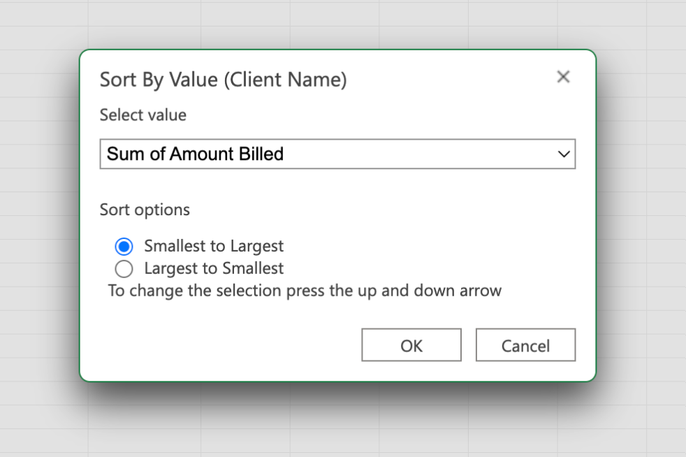
Now click the dropdown next to the Client Name, cell and select Sort By Value. In the pop-up, Sum of Amount Billed will already be selected. You can choose to sort by smallest to largest or vice versa, depending on your needs. Click OK.
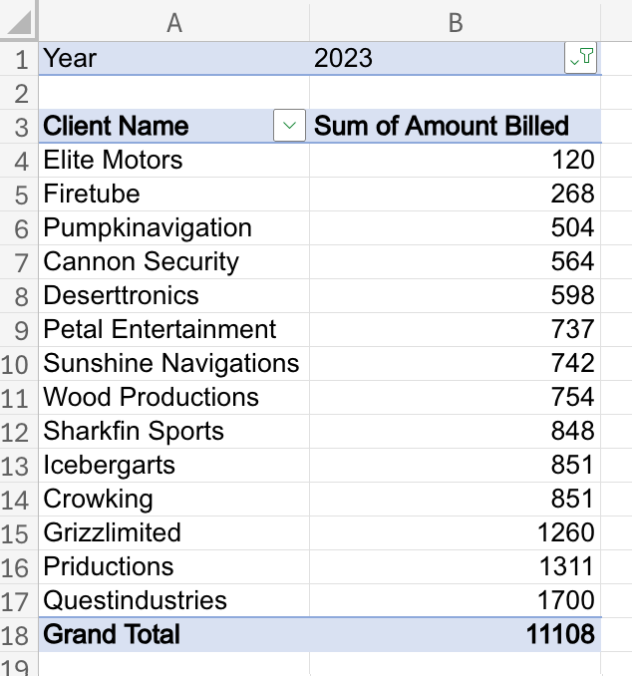
The pivot table now shows exactly how much each client was billed in the year 2023, in ascending order: With $1,700, Questindustries was the highest billed client in 2023.
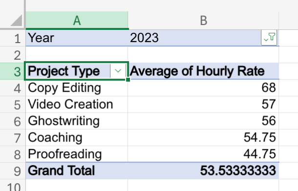
Let’s answer one more question: Which project type had the highest hourly rate on average?
We can now shift from total amount analysis to the average hourly rate.
To do this, remove Client Name from the Rows section and replace it with Project Type. In the Values section, remove Amount Billed, and drag in the Hourly Rate field instead.
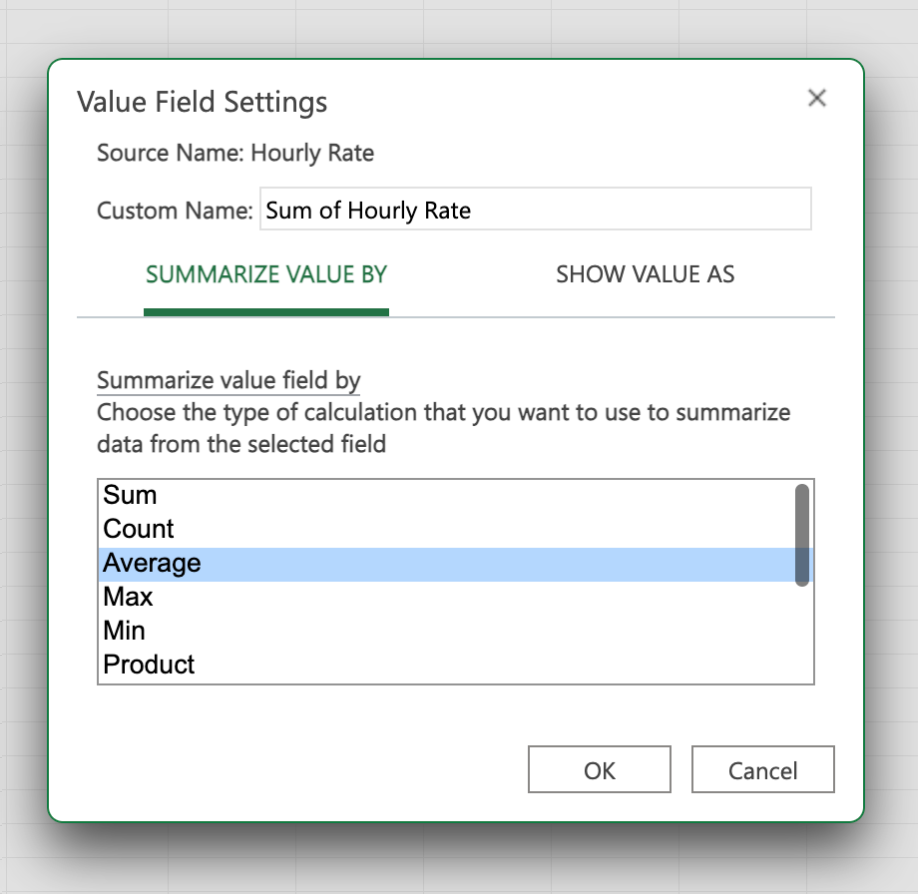
Now, click on the arrow next to Sum of Hourly Rate, and select Value Field Settings. Here, switch from Sum to Average. Click OK.
Then in the pivot table, go to the Project Type dropdown, select Sort by Value, and switch to the Largest to Smallest option to see the highest hourly rate at the top of the list. You’ll instantly see the average hourly rate across all project types in 2023. The highest hourly rate on average is $68 per hour for copyediting.
Practice your pivot table skills
Now that you understand the basics of pivot tables in Excel, use my demo sheet to try some even more advanced analyses. Once you get familiar with all the parameters, you’ll be able to use them to generate any report that you want. And if you run into problems, here’s how to fix the most common errors in Excel.
Related reading:
This article was originally published in July 2019. The most recent update, with contributions from Nicole Replogle, was in September 2024.