You can center the absolutely positioned element using the transform property in the div.
You can see the element is removed from the normal flow when you place the element absolutely positioned. Therefore, the regular way of centering the element won’t work for these positioned elements. You can use CSS properties like transform, margin: auto, flexbox for centering the element. Let’s discuss these methods in detail.
Table of Contents:
Understanding Absolute Positioning
If you set the element to position: absolute, it is positioned relative to the ancestor(eg, relative, absolute, or fixed). And if no ancestor exists, it is positioned relative to the body. For centering the absolutely positioned element in the parent container, we need to clearly mention the position.
Methods to Center the Absolutely Positioned Elements
You can use CSS properties like transform, margin auto, and layouts such as flexbox and grid to center the absolutely positioned elements. Let’s discuss them below.
Method 1: Using Transform Property
The top: 50% and left: 50% are used to place the element in the top-left center to its parent. And apply the transform: translate(-50%, -50%) to shift it back by half of its width and height. And this will center the element.
Example:
<!DOCTYPE html>
<html lang="en">
<head>
    <meta charset="UTF-8">
    <meta name="viewport" content="width=device-width, initial-scale=1.0">
    <title>Center Absolute Element</title>
    <style>
        .parent {
            position: relative;
            width: 300px;
            height: 300px;
            background-color: lightgray;
        }

        .child {
            position: absolute;
            top: 50%;
            left: 50%;
            transform: translate(-50%, -50%);
            width: 100px;
            height: 100px;
            background-color: blue;
            text-align: center;
            color: white;
            display: flex;
            align-items: center;
            justify-content: center;
        }
    </style>
</head>
<body>
    <div class="parent">
        <div class="child">Centered</div>
    </div>
</body>
</html>
Output:
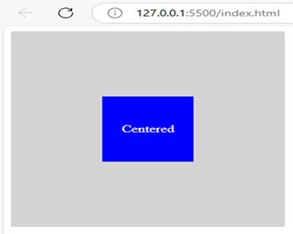

Explanation: This code makes the child element to get centered inside the parent div. The parent element is set to relative positioning and the child element uses top: 50%, left: 50%, and transform: translate(-50%, -50%) to get centered.
Method 2: Using Flexbox
You can center an element using Flexbox by setting the parent container to display: flex. Then use justify-content: center; and align-items: center to center the child element.
Example:
<!DOCTYPE html>
<html lang="en">
<head>
    <meta charset="UTF-8">
    <meta name="viewport" content="width=device-width, initial-scale=1.0">
    <title>Flexbox Centering</title>
    <style>
        .parent {
            position: relative;
            display: flex;
            justify-content: center;
            align-items: center;
            width: 300px;
            height: 300px;
            background-color: lightgray;
        }

        .child {
            position: absolute;
            width: 100px;
            height: 100px;
            background-color: blue;
            text-align: center;
            color: white;
            display: flex;
            align-items: center;
            justify-content: center;
        }
    </style>
</head>
<body>
    <div class="parent">
        <div class="child">Centered</div>
    </div>
</body>
</html>
Output:
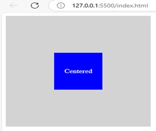

Explanation: The parent div is set to display: flex, justify-content: center, and the child div is positioned absolutely within the parent.
Method 3: Using Margin Auto
You can set top: 0, left: 0, right: 0, bottom: 0, and margin: auto to only work when the child element has a fixed width and height.
Example:
<!DOCTYPE html>
<html lang="en">
<head>
    <meta charset="UTF-8">
    <meta name="viewport" content="width=device-width, initial-scale=1.0">
    <title>Margin Auto Centering</title>
    <style>
        .parent {
            position: relative;
            width: 300px;
            height: 300px;
            background-color: lightgray;
        }

        .child {
            position: absolute;
            top: 0;
            left: 0;
            right: 0;
            bottom: 0;
            margin: auto;
            width: 100px;
            height: 100px;
            background-color: blue;
            text-align: center;
            color: white;
            display: flex;
            align-items: center;
            justify-content: center;
        }
    </style>
</head>
<body>
    <div class="parent">
        <div class="child">Centered</div>
    </div>
</body>
</html>
Output:
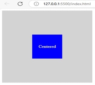

Explanation: Using margin: auto, the child div is centered inside the parent div. The child div is absolutely positioned inside the top: 0, left: 0, right: 0, bottom: 0, and margin: auto.
Method 4: Using Grid Layout
You can center an element using CSS Grid by setting the parent container to display: grid and place-items: center. This will allow you to align the absolutely positioned element to the center.
Example:
<!DOCTYPE html>
<html lang="en">
<head>
    <meta charset="UTF-8">
    <meta name="viewport" content="width=device-width, initial-scale=1.0">
    <title>Grid Centering</title>
    <style>
        .parent {
            position: relative;
            display: grid;
            place-items: center;
            width: 300px;
            height: 300px;
            background-color: lightgray;
        }

        .child {
            position: absolute;
            width: 100px;
            height: 100px;
            background-color: blue;
            text-align: center;
            color: white;
            display: flex;
            align-items: center;
            justify-content: center;
        }
    </style>
</head>
<body>
    <div class="parent">
        <div class="child">Centered</div>
    </div>
</body>
</html>
Output:
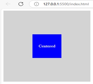

Explanation: You can use this code to get the child element absolutely positioned inside the parent element. Properties such as display: grid and place-items: center are used for this purpose.
Conclusion
The above-discussed methods are used to center the absolutely positioned element in the div. You can use the CSS properties such as transform and margin auto and layouts such as Flexbox and Grid are used for this purpose. It makes sure that the centre element is inside the parent element. You can make your webpage look structured by centering the elements using these properties.
How to Center the Absolutely Positioned Element in div Using CSS? – FAQs
1. How can I center an absolutely positioned element using CSS transforms?
You can set top: 50% and left: 50% to move the element’s top-left corner to center the element and use transform: translate(-50%, -50%) to shift it to half of its width and height.
2. Can I use Flexbox to center an absolutely positioned element?
Yes, you can set the parent container to display: flex and then use justify-content: center and align-items: center to center the child element.
3. How do I center an element using margin auto?
Set top: 0, left: 0, right: 0, and bottom: 0 to position the element, and margin: auto to center it. It only works if the child element has a fixed width and height.
4. Can CSS Grid be used for centering?
Yes, you can set the parent container to display: grid and use place-items: center to align the child element both horizontally and vertically.
5. Which method is the easiest to use?
It is completely based on your need and preference for the project to work. Layouts such as Flexbox and Grid are said to be flexible, since you can control the elements precisely.