As a web designer in the mid-2010s, I used what everyone recommended at the time: WordPress. While it’s a great tool, I found myself spending hours trying to fix spacing issues, reconcile bugs created by incompatible plugins, and troubleshoot server errors. (There’s nothing quite as terrifying as WordPress’s “White Screen of Death.”) Because of this, I deeply understand the pain points that website building apps were created to solve. Most of those apps, though, are aimed at beginners and small businesses, not designers.
Framer and Webflow are an exception: they’re aimed at professionals, not beginners. While that means they’re not quite as easy to get started with as alternatives like Squarespace, there’s almost no limit to what you can design—or how much you can scale—on either platform.
While you can’t go wrong with either app, each has different use cases. To compare them, I got hands-on with both Framer and Webflow by creating multiple websites and testing the latest features of each platform. In this article, I’ll explain the pros and cons of Framer and Webflow to help you decide which you should use.
Framer vs. Webflow at a glance
Here’s my take on the key differences between these two website building apps:
-
Framer is best for designers and startups. It’s straightforward to use, making it easy to spin up stunning landing pages, interactive prototypes, and minimum-viable products. With its powerful CMS and localization features, Framer can scale with you as you grow.
-
Webflow is best for developers and enterprise use. It has a steeper learning curve, but there’s no better platform for bringing custom website and eCommerce designs to life, and its CMS and localization features are enterprise-grade. While you can accomplish plenty with Webflow’s no-code features, developers get access to even more customization.
|
Framer |
Webflow |
|
|---|---|---|
|
Ease of use |
⭐⭐⭐⭐⭐ Easier to learn and use than Webflow (especially if you can’t code) |
⭐⭐⭐ Steeper learning curve but more powerful (especially if you’re a developer) |
|
Design and templates |
⭐⭐⭐⭐ Ideal for landing pages and prototypes; slick animations and pre-built components, along with 1,200+ templates |
⭐⭐⭐⭐ Best for large sites, complex layouts, and precise, custom designs; a wide selection of 1,500+ templates |
|
eCommerce and marketing |
⭐⭐ No eCommerce features, but integration with Gumroad makes it a decent option for digital products; basic SEO and analytics |
⭐⭐⭐⭐ Not as plug-and-play as most eCommerce solutions, but it’s a good no-code alternative to Shopify for custom shop designs; basic SEO and analytics |
|
CMS and scalability |
⭐⭐⭐⭐ Better CMS usability than Webflow, but more limited CMS collections; impressive localization features; can’t export code. |
⭐⭐⭐⭐ More CMS fields and collections than Framer, along with comprehensive localization options; you can export your code and host elsewhere |
|
Pricing |
⭐⭐⭐⭐ As little as $10/month for the entry-level Mini plan; $20/month Basic plan and $40/month Pro plan offer more pages, CMS collections, and monthly visitors (higher pricing for collaboration and localization) |
⭐⭐⭐ Starts at $18/month; the $29/month plan unlocks CMS features, while the $49/month Business plan gives you up to 300 pages and more CMS items (higher pricing for eCommerce, collaboration, and localization) |
|
Integrations |
⭐⭐ 10+ integrations |
⭐⭐⭐⭐⭐ 150+ native integrations; integrates with thousands more apps via Zapier |
Framer is easier to use
A caveat up front: the term “ease of use” here is relative. Neither Framer nor Webflow can compare with the user-friendliness of more consumer-oriented website building platforms like Squarespace. Framer and Webflow’s target audience of startups, agencies, SaaS companies, and enterprise organizations is already technically competent and has designers on staff; neither app is intended for small business owners making their first website. Because of this, the focus is more on design horsepower than ease of use.
That said, Framer is easier to learn and use than Webflow, especially for those familiar with design tools like Figma. It’s more intuitive and has fewer settings crowding the interface. Onboarding is simple: there’s a checklist, interactive tooltips, and an option that sends you straight to an impressive selection of templates. (If you’ve got the time, there’s also a 52-minute comprehensive onboarding video.)
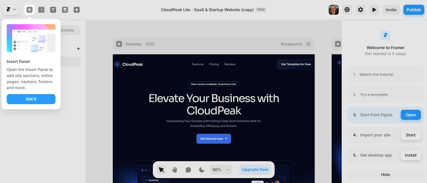
A quick scroll through Framer’s home page makes one thing clear: they’re eager to let you know that the experience is a lot like Figma. (“Framer offers a design experience like Figma, complete with an infinite canvas and a full suite of layout, styling and text features.”) While I haven’t used Figma—so I can’t comment on the direct comparison—the Framer experience is definitely closer to the Adobe suite of design products than it is to a Squarespace-style platform.
Framer’s infinite canvas makes it easy to zoom out and get a bird’s-eye view of your designs, including versions for desktop, tablet, and mobile. An intuitive section called Assets makes it simple to edit site-wide elements like buttons, calls to action, menu items, and lists. (You can also adjust site-wide color schemes and fonts here.)
By contrast, in Webflow, it takes some digging around to make straightforward changes like this, and the user interface is more crowded. But with this steeper learning curve comes more advanced capabilities, especially if you have coding knowledge. Webflow is incredibly flexible and customizable, making it well-suited to the needs of enterprise users, developers, and more complex use cases.
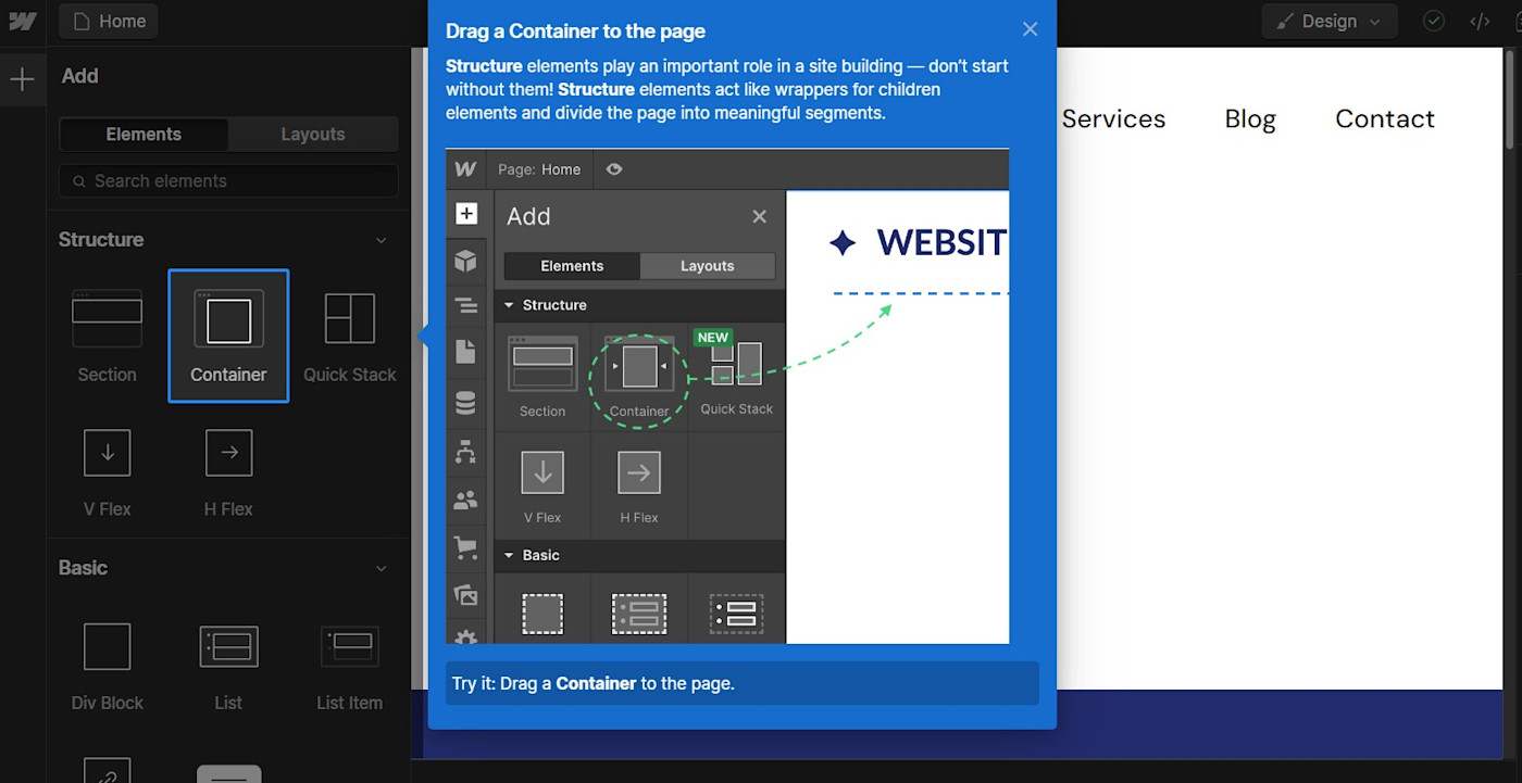
Despite its complexity, Webflow does an admirable job of easing you onto the platform. If it’s your first time using Webflow, I highly recommend the Guided Tutorial option: via a series of interactive tooltips, you’ll learn the essentials of Webflow’s interface in a few minutes. (You can also jump straight into building a site if you prefer.)
Framer also has an AI website builder (Webflow has yet to launch theirs). To test it, I used the following prompt to generate a fictional landing page: “Create a website for my SaaS company, Bingo. We help connect dog owners with experienced dog walkers, helping you take care of your furry best friend whether you’re home or not.”
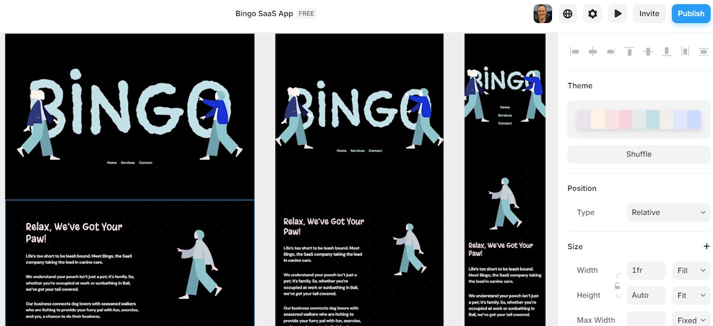
The copy, generated via the OpenAI API, was relevant enough. But—strangely enough for a design app—the AI-generated designs were absolutely bleh. (And there were no dogs in sight!) While it was easy to regenerate the design, and to swap colors and fonts, I couldn’t land on anything that felt like a helpful starting point. Still, it’s a good example of where AI website builders are going.
Finally, templates are a strong point for both Webflow and Framer. At 1,500+ templates, Webflow has a slightly larger library of options, but you have to pay for most of them.
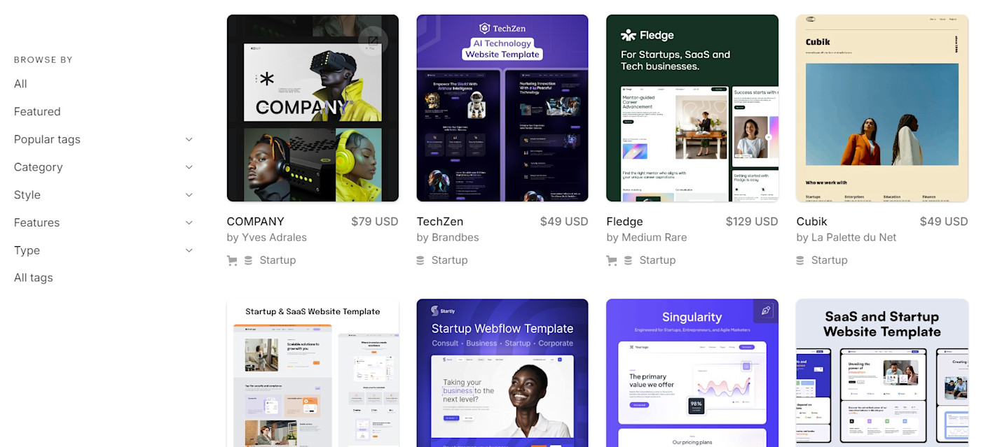
Framer has a similarly robust selection of 1,200+ templates and most are slickly designed. Framer also has a better selection of complete free templates than Webflow does, with about 250 options. My only gripe is that launching these templates—which are all produced by third-party agencies and designers—is cumbersome. Instead of getting started immediately with your design, you have to submit your email address and wait to receive an email with the next steps. (Framer seems to pass your email on to the template designer, which in my case led to daily promotional emails until I unsubscribed.)
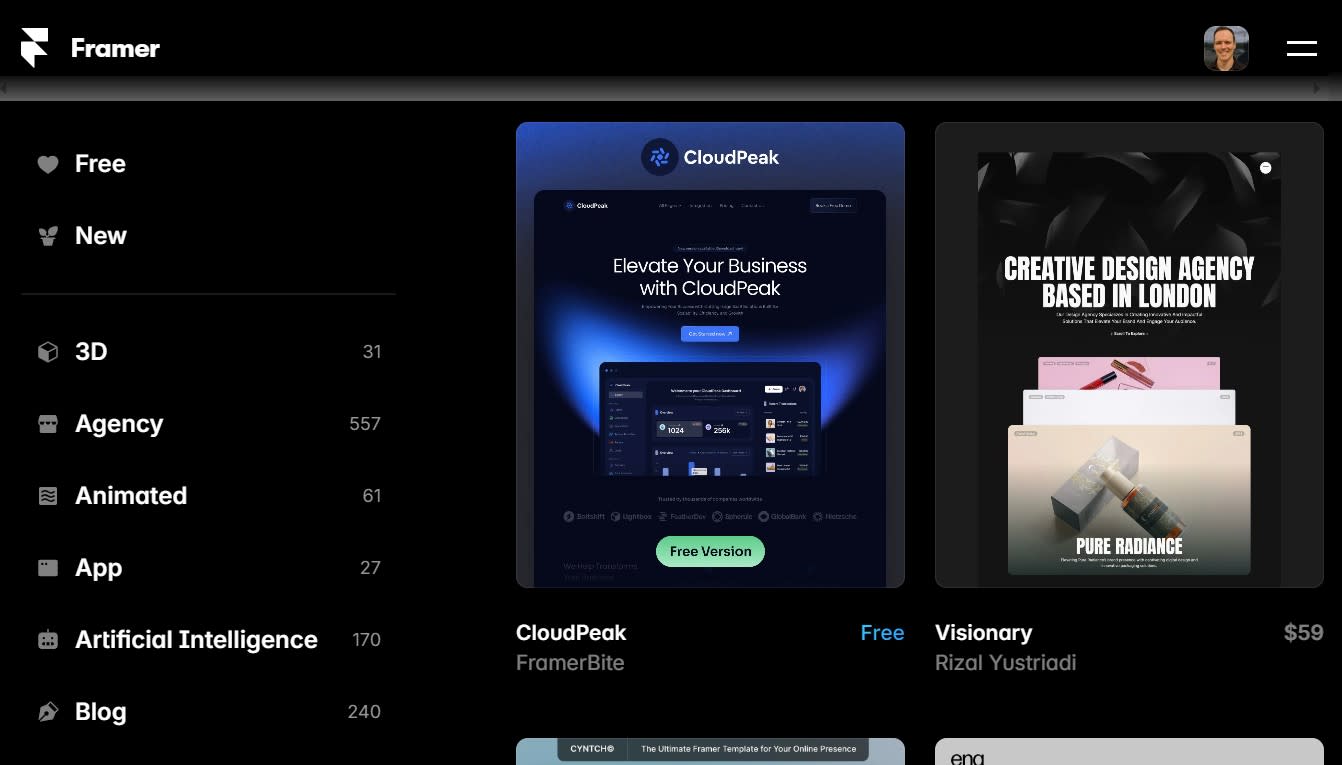
Webflow is better for complex designs, while Framer has slicker animations and components
In both Framer and Webflow, you’ll find everything you’d expect from a sophisticated website building app. Both platforms offer drag-and-drop interfaces for design, along with pre-built templates and reusable design elements.
Webflow provides more extensive customization options, along with complex layouts. Clicking on any given item opens up an impressive array of settings: for example, selecting a heading gives you the option to tweak spacing (down the pixel), adjust positioning (static, fixed, or sticky), adjust backgrounds and borders, and add effects like blending, box shadows, and cursor changes.
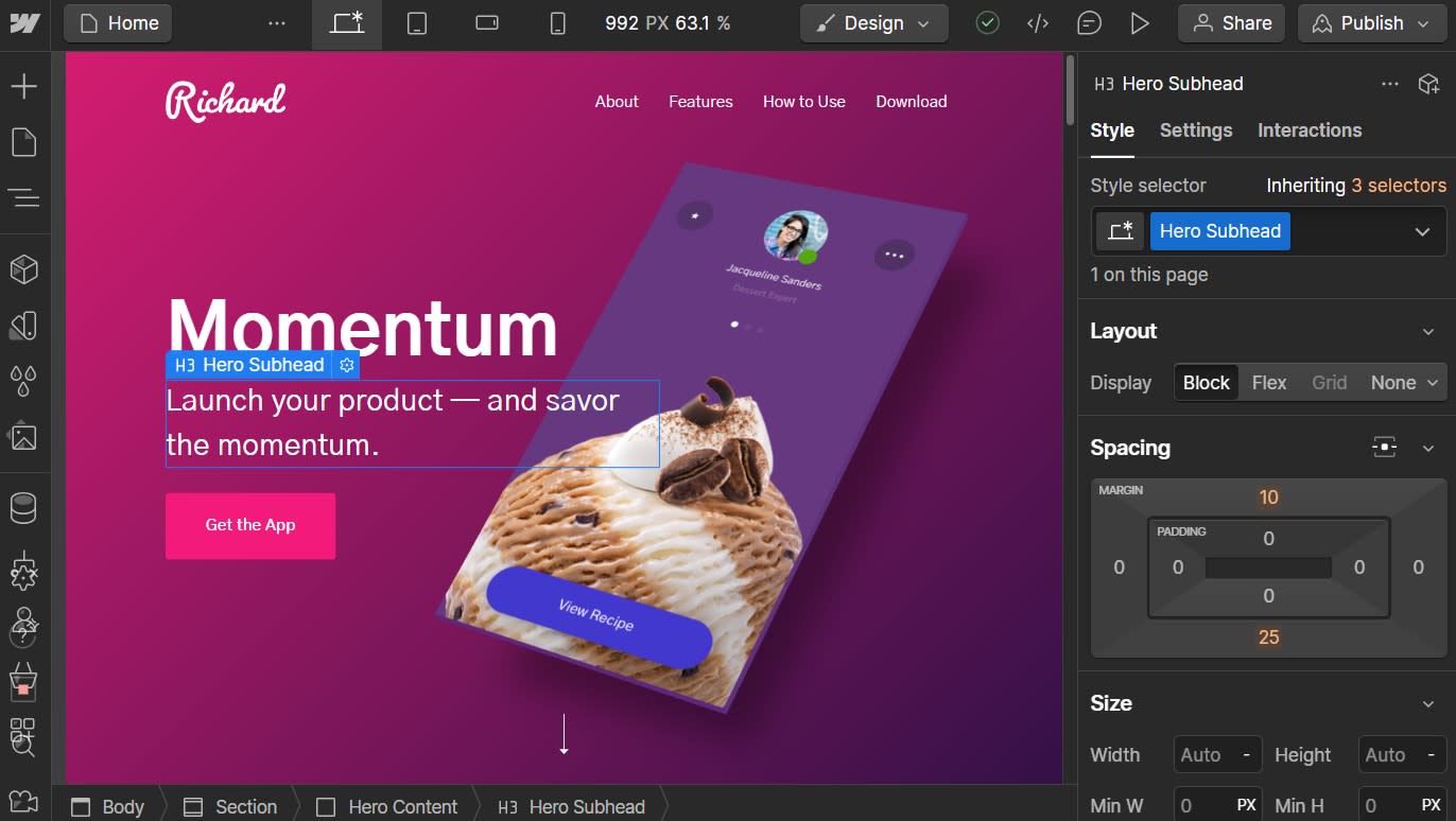
Meanwhile, Framer is well-suited to quickly creating interactive prototypes, minimum viable products (MVPs), and animation-enhanced landing pages. Framer can import your Figma designs and mockups and convert them into dynamic websites—even preserving your layers and elements. (Webflow has a plugin that does the same thing.)
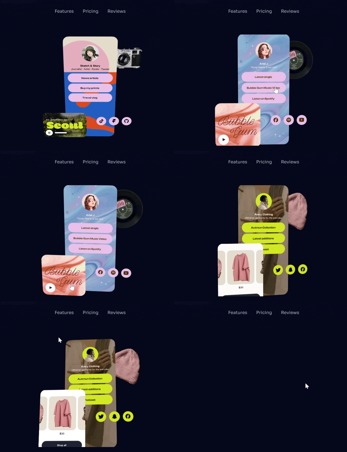
Framer and Webflow are both known for their slick animations. By tweaking a few settings in either, you can easily accomplish effects that, a decade ago, used to take serious custom programming. Even better, most templates come pre-programmed with subtle animations. While Webflow and Framer both offer polished visual effects, Framer’s advantage is its impressive Components library, which allows you to copy pre-built interactive elements—like the one I embedded in my test site below—from other designers.
Webflow lets you create custom no-code eCommerce shops
If you’re looking for an all-in-one website builder with eCommerce and marketing built in, let me point you in the direction of some pupose-built eCommerce website builders. With Framer and Webflow, you get a sophisticated array of collaborative design features—but neither app attempts to be a Swiss Army Knife solution to all your needs.
There is an exception, however: Webflow offers a highly-customizable eCommerce solution that might be right for you if you’re looking for a unique, non-templated look. Webflow is an easier way to bring custom eCommerce designs to life than WooCommerce, which can be clunky and imprecise, or Shopify, which requires a developer familiar with JavaScript, JSON, and Liquid (Shopify’s templating language). Pairing Webflow’s powerful design capabilities with eCommerce features results in creative storefront concepts like the below, which—despite the lamentable idea of adding hot sauce to coffee—feels quite unlike the average Shopify theme.
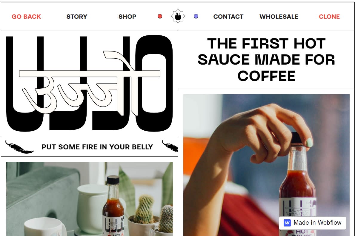
But—fair warning—Webflow’s approach to eCommerce requires some patience. Unlike Squarespace or Wix, it’s complex enough that you won’t get your shop up and running in a day, and it’s a less comprehensive option than Shopify. For example, you’ll run into trouble in Webflow when trying to set volume discounts, offer in-store pickup options, or accept payments in non-USD currencies.
Framer isn’t designed for eCommerce at all, but there is a workaround: you can integrate your website with Gumroad or Lemon Squeezy, both of which are aimed at helping creators sell digital products and process payments. Although transactions happen off-site in another browser tab, Framer is worth looking into if you’re selling courses, templates, or other online products.
Neither Framer nor Webflow offers much in the way of integrated marketing tools. Here, you get the basics: forms, SEO, and analytics. Webflow offers something it calls “Automated SEO,” which saves time (especially at scale) by populating each page’s metadata with information from your CMS collections. Framer’s SEO options are more lightweight, but they still give you the ability to tweak your sitemap settings, add and edit schema markup, and manage 301 redirects.
Both apps make it easy to scale your website
Framer and Webflow both position their platforms as ideal for scaling your website, and each offers a robust content management system (CMS). Managing hundreds (or thousands) of pages manually quickly becomes unwieldy; with a CMS, each page starts out as a data entry that’s later dynamically displayed using a template.
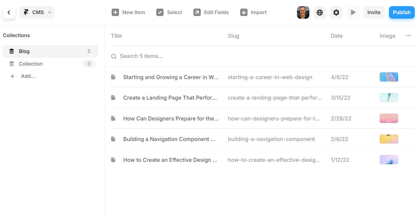
While both apps have similar content management systems, Webflow has an edge: it offers more CMS field types, meaning you can add a more diverse set of information to each entry. (This comes in handy if you’re creating complex pages.) Webflow also lets you create a total of 40 CMS “collections,” which are unique content categories like blog posts, job listings, projects, or case studies; Framer offers just 10 CMS collections.
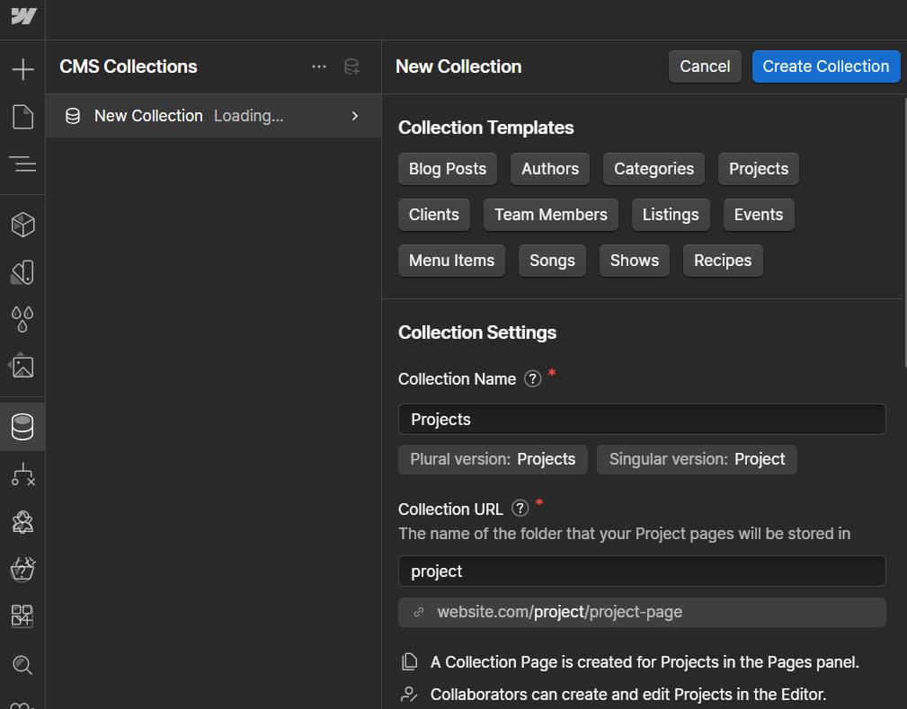
Apart from those differences, Framer’s user interface just makes the CMS experience smoother—it feels less intimidating to navigate than Webflow’s.
Both Framer and Webflow make it simple to scale your web presence internationally via localization tools. What’s most impressive about this feature is that translating your content (which happens quickly via AI) is only the start. Images, calls to action, and menu items can also be localized—and you can route users automatically based on their location. For example, a user in Paris might see a website in French with images of the Champs-Elysées and a prominently-displayed Parisian office address; meanwhile, a New York audience would see an American-ified version of that content.
Something else to keep in mind, especially as your website grows, is how “locked in” you are to the platform you’ve selected. With Webflow, you can export your website’s code and self-host it elsewhere; with Framer, you can’t. While this won’t be a priority for most users—since it’s much easier to simply host on the platform—it’s good to keep in mind from a redundancy standpoint. (For example, what options do you have if either app shuts down or dramatically increases its pricing?)
Framer is slightly cheaper
Framer is more affordable than Webflow. If you just need a simple landing page, you’ll pay as little as $10/month for the entry-level Mini plan; for more pages, CMS collections, and monthly visitors, you can upgrade to Framer’s $20/month Basic plan or $40/month Pro plan.
Webflow’s entry-level Basic plan starts at $18/month. The $29/month CMS plan unlocks CMS functionality, while the $49/month Business plan gives you up to 300 pages and up to 10,000 CMS items. Webflow offers a separate pricing scheme for eCommerce sites, ranging from $42/month to $235/month depending on the size of the site.
If you’re planning to collaborate with multiple users—for example, as an agency or as part of an in-house design team—both apps require you to upgrade to a Workspace plan with per-user pricing. Framer starts at $25/month per user, while Webflow’s cheapest option is $24/month per user.
Both apps have similarly-generous free plans that let you test out most features, but you’ll need to upgrade to a paid plan to remove branding and to publish to a custom domain.
Webflow has more integrations, including with Zapier
Framer has fewer than a dozen integrations, including Hotjar, HubSpot, Intercom, and Calendly. Webflow, on the other hand, has an expansive ecosystem of tools and plugins, with 150+ integrations like LiveChat, Outseta, and Typeform.
Plus, using Zapier, you can connect Webflow to thousands of other apps. Learn more about how to automate Webflow, or get started with one of these pre-made workflows.
Zapier is the leader in workflow automation—integrating with thousands of apps from partners like Google, Salesforce, and Microsoft. Use interfaces, data tables, and logic to build secure, automated systems for your business-critical workflows across your organization’s technology stack. Learn more.
Framer vs. Webflow: Which is best?
To compare Framer and Webflow for this article, I’ve taken pains to highlight their differences. But ultimately, they’re quite similar—and you can’t go wrong with either option. If you’re not quite sure which one to go with, here are some final thoughts to keep in mind.
Choose Framer if you’re looking for an easy-to-use platform with stunning design outputs. With Framer’s impressive templates, animations, and pre-built components, you can create designs that are almost indistinguishable from high-end tech and SaaS websites—and you’ll have the option to scale up as your business grows.
Choose Webflow if you’re creating custom designs for larger sites. Webflow offers pixel-perfect design control, enterprise-grade scaling features, a robust CMS, and 150+ integrations. If you want to create a highly-custom eCommerce shop design, it’s a solid Shopify alternative; Webflow is also a good choice if you’d like the option to export your website code and self-host.
Related reading: